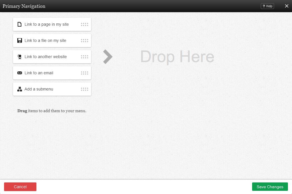
navigation component is used for adding navigation items in the form of lists of links. This service works in the same way as the Website Navigation section on the Toolbar with an added "Add a Submenu" option and the ability to be added to any content section of your website.
Hover Menus can optionally be created for any nested sub-menus you create with this component.
Where to Find
This Component can be found in the "Add Content to Page" section of the Toolbar.
Adding to Website
After selecting this Component, you will be able to choose exactly where you want to add it!
You will see all available content locations it can be added to - on the current page only (content locations in Gold), on every page (content locations in Red), or on every page under the current page directory (content locations in Blue. For example - if you are editing a page called "About", the blue content locations would allow you to add this component to all pages under the /about/ directory).
Options
You can optionally set a Title to be displayed above the navigation content on your page.
You can arrange the order of your links in the Menu Items field by grabbing the "Drag" area beside a page and moving it above or below others. This will change the order in which your links display within the navigation component.
You can also drag the following items from the column on the left into the menu items section:
- Link to a page in my site will allow you to insert a page into your navigation menu.
- Link to a file on my site will allow you to insert a file into your navigation menu. You can choose a file from your file manager by clicking on the "Browse" button.
- Link to another website will allow you to insert a link to an external address into your navigation menu. You can choose to open a link to another website in a new window using this link type!
- Link to an email will allow you to insert a link to an e-mail address into your navigation menu.
To create a submenu, move one of the items in the field slightly to the right, so that it is indented beneath another element. This will cause the indented element to become the first item in a sub-menu, and any other intended items beneath it will appear as other sub-menu items beneath that one.
The sub-menu will appear under the first navigation component above them that is not indented, so that when that item is hovered over on the live site the sub-menu will drop down beneath it.
Editing
Need to make a change? You can access the settings for this Component again by clicking on the "Settings" button on the Component Toolbar.
Example Sites
An example of this Component can be viewed on the Web Tools page of http://builderexample.com


